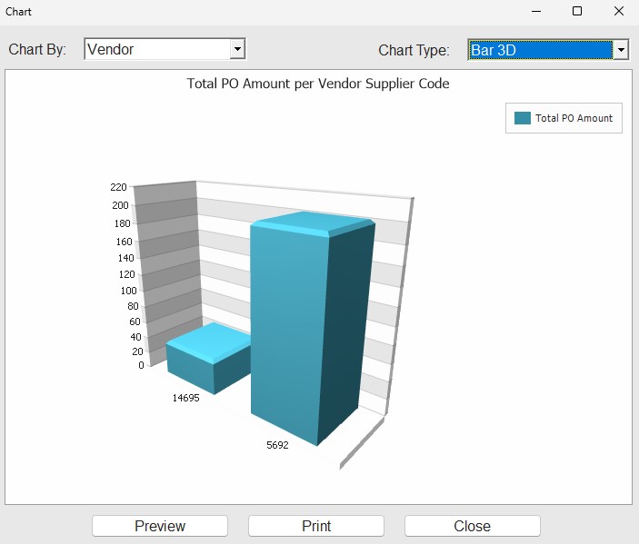
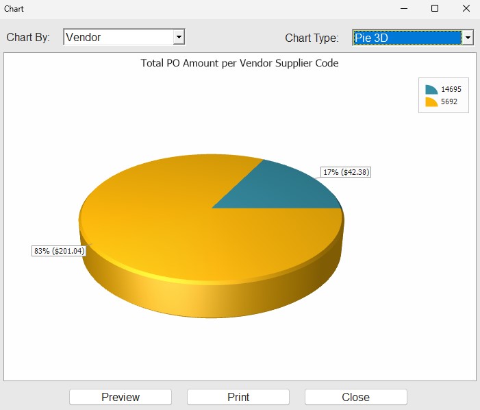
… that you could pull up charts/graphs on the Purchasing Dashboard screen?
In the grid, right-click a column header (or ‘Group By’ box) and select ‘Chart’. The ‘Chart’ pop-up opens, displaying a Pie Chart by default, showing the data in the grid.
Click on the chart to filter the underlying grid data.
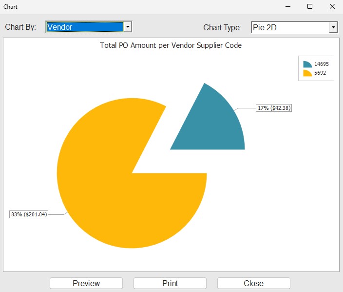
Choose a ‘Chart Type’, of pie, bar, or line, in 2D or 3D.